Case Study - UI Elephant Art
I was employed as a UI designer to work on-site with Elephant’s digital team, comprising Product Owner, UX designer, Systems Architect, Developer and me.
The UX designer, Georgia Sugarman, had already started some comprehensive research which laid the foundations of the project. These constantly evolved and fed into our thinking around the structure and design of this website.
The Problem
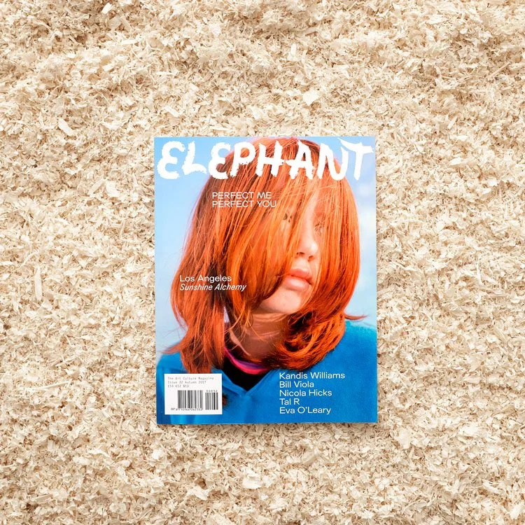
’Elephant’ existed as a print magazine, produced 4 times/year with dense editorial and often edgy imagery. It had a loyal, but small readership in the art community and the magazine itself had just gone through a successful redesign by Kellenberger White. Elephant (owned by Colart) needed to engage with their readers on a daily basis, increase revenue via subscriptions and introduce readers to their ‘mother brand’ Colart who own several companies making art materials.
A highly adaptable digital version of the magazine which allowed editorial staff to upload content into a series of well-designed modules and publish content daily, with the ultimate goal of driving readers to subscribe to the magazine.
Results of the re-design
Following a 90 day sample pre and post launch.
Users - 53K (up 67.1%)
Revenue - £8.7K (up 41.1%)
Sessions - 73K (up 59.3%)
The Solution
The Process
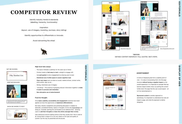
Georgia interviewed all the editorial team and a number of current users with the end goal of making the UX of the site work for both users and the team. She created a competitor audit to understand industry trends & standards, get inspired, identify opportunities for innovation or differentiation, and to avoid reinventing the wheel in the publishing and art worlds. This fed into how I would approach the UI.
Editorial staff interviews
Competitor Analysis
Stage 1 - Research (Georgia)
Stage 2 - Synthesis (Georgia)
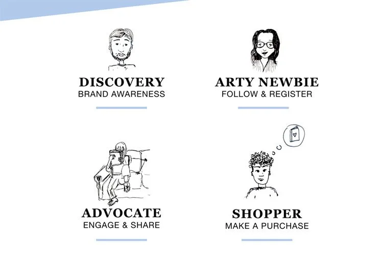
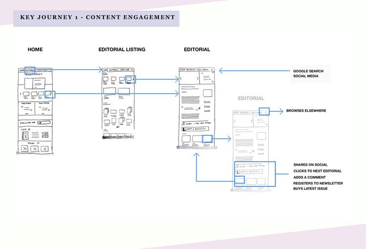
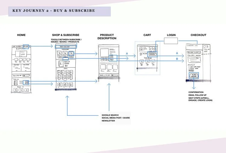
Georgia created 4 short stories to tell us about our users motivation, their specific goals and actions on our website. This enabled her to map out the key user journeys required within the business parameters to ‘engage users and drive subscriptions’. These user journeys drove the functional requirements of the site and several iterations of wireframes
Current site audit
Site structure detailed analysis
Stage 3 - Ideation/Iteration (both)
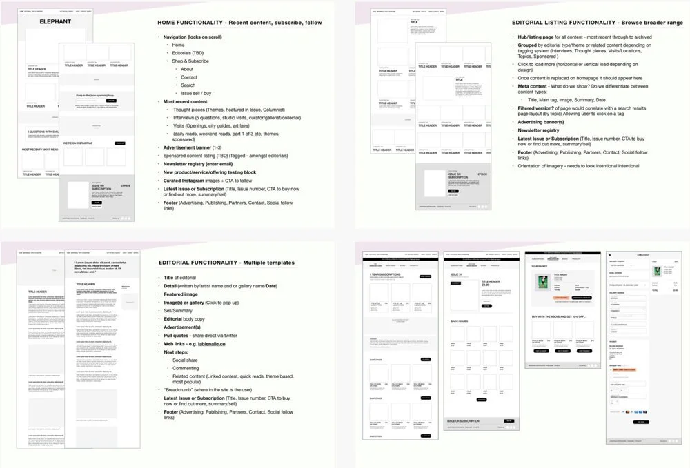
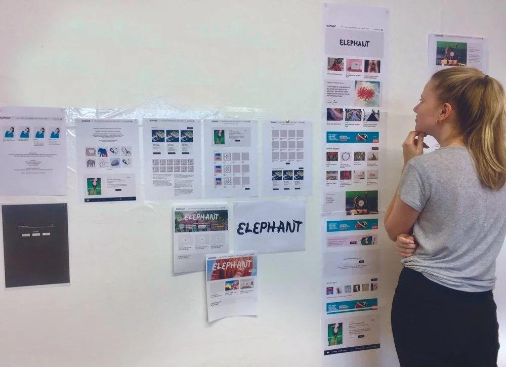
Low Fidelity Wireframes / testing & review
High Fidelity wireframes
Prototype testing with stakeholders
Low and then high fidelity wireframes in clickable prototypes helped the user journeys became more defined to the MVP focus.
Stage 4 - UX informing UI
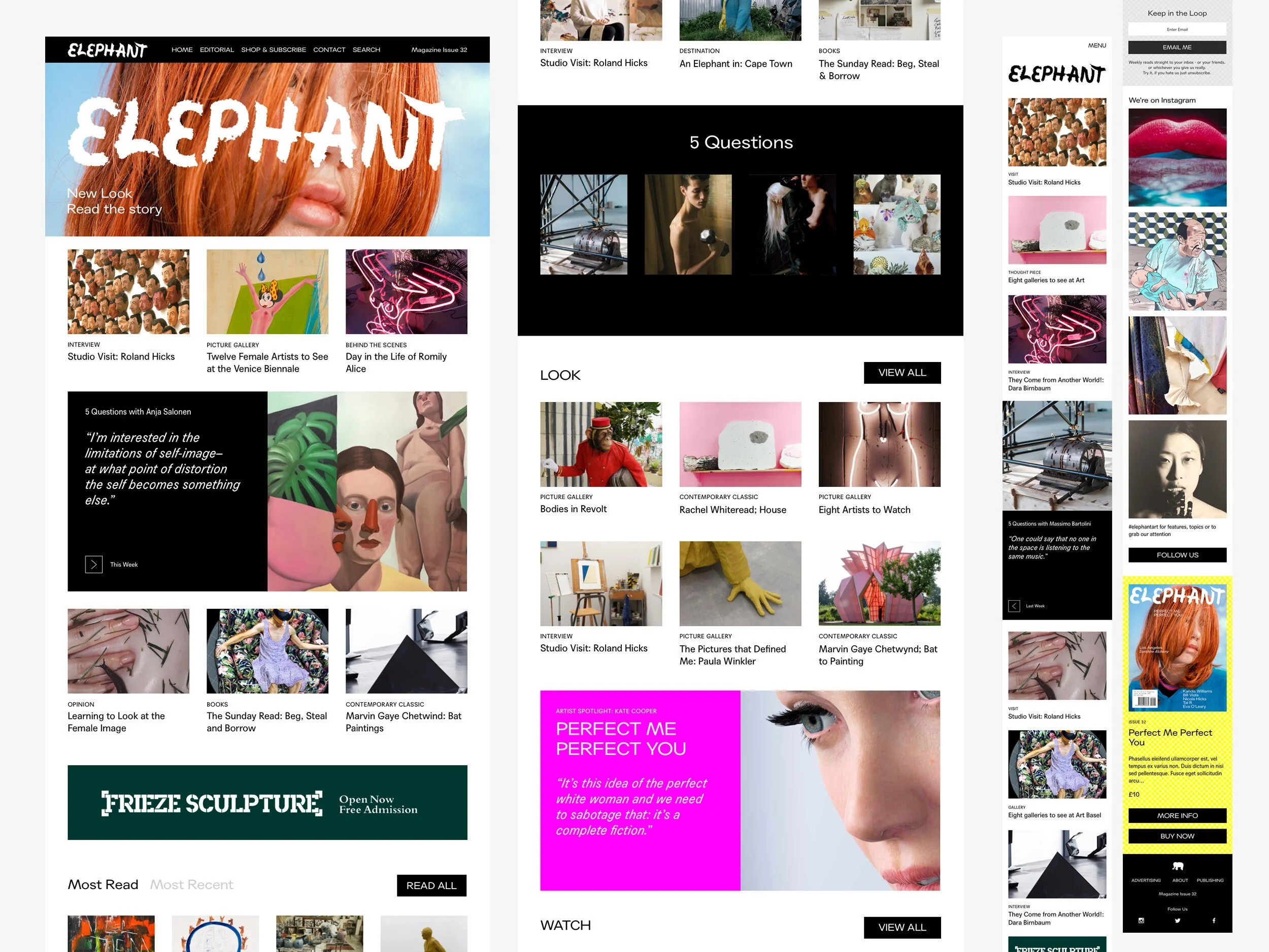
I looked at lots of layout options. We considered different menu choices, advertising location, positioning of ‘buy now’ buttons to monetise the project, as well as how best to tag the content. This began as ‘read’ and then changed after user testing to become ‘editorial’ where a user was driven to ‘read’, ‘look’ or ‘watch’.
Stage 5 - UI Tests
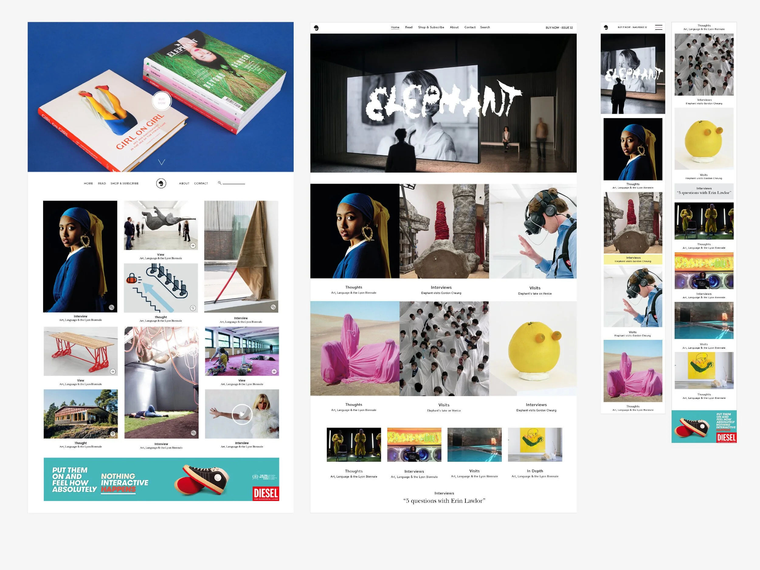
Homepage designs including modules like ‘5 questions’ which the editorial team could add or take away according to their content. The font introduced mimicked the magazine styling and on launch, the ‘Elephant’ logo dominated the top of the screen, whilst parallax scrolling in this area brought some subtle movement into the design.
Stage 6 - UI homepage
After meeting the magazine designers, I discovered that their vision (and colour palette) for the magazine involved a pure representation of the CMYK printing process and use of a particular font. I therefore changed the palette on the magazine in a 2nd stage of designs to hint at RGB colour combinations used in digital colour processes.
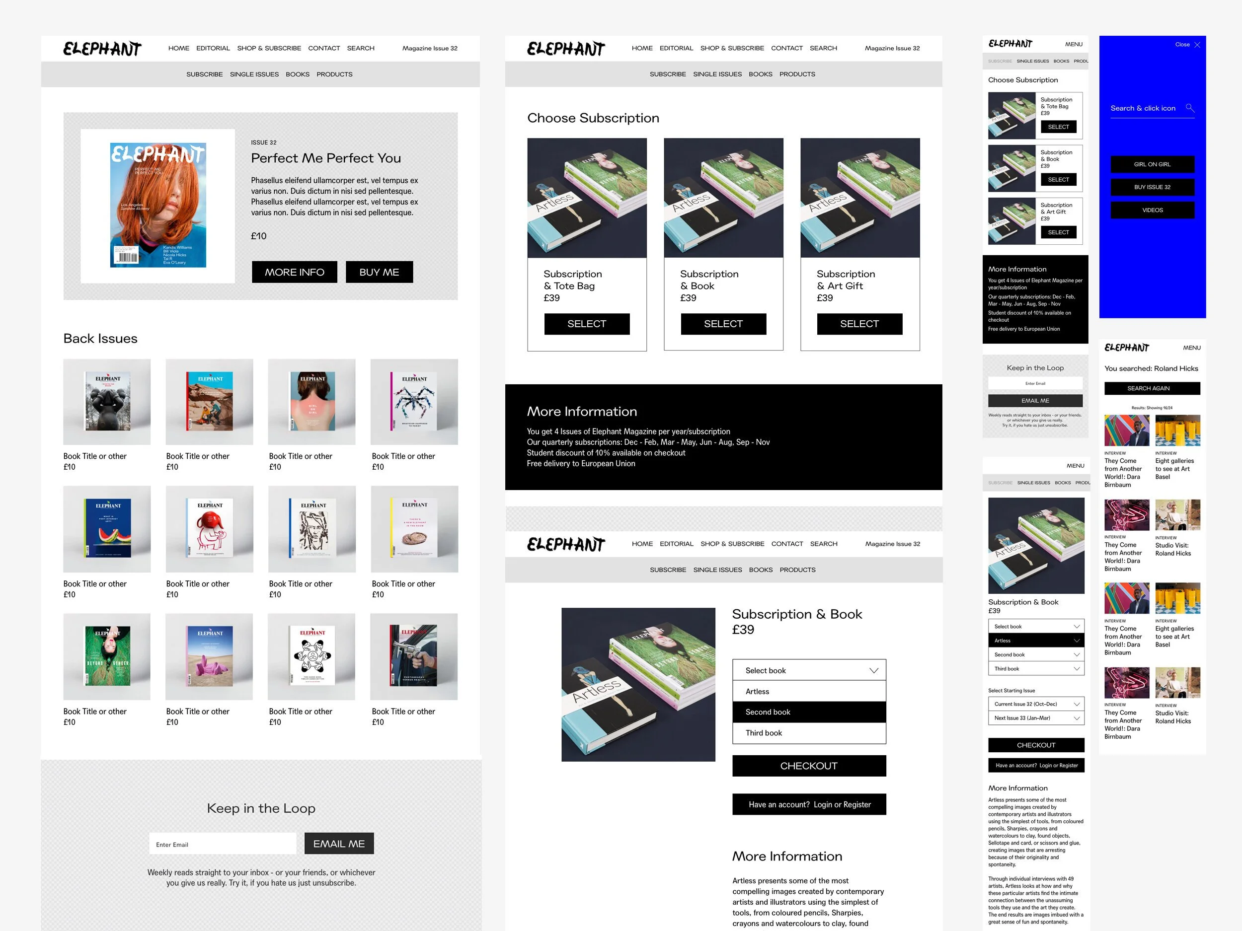
Part of the brief was to send readers to the subscription area of the site, where they could subscribe to the print magazine (which contained considerably more content than the online version, as well as books and other art products). We tested the ease of going through the subscription process on several people in the team and iterated to streamline the process.
Stage 7 - UI Subscriptions
ResultsElephant Art website re-design.
Following a 90 day sample pre and post launch.
